
Our first AI garden room looked lovely. It also ignored what we hated.
Our first render proved the garage wall could become something special—and also proved that a pretty picture is perfectly capable of missing the point.
The garage wall
This part of the story began with three photographs that were not going anywhere near the cover of Homes & Gardens.
The garage wall was covered in ivy. The ground was mostly gravel with a collection of old paving shapes wandering through it. There was a water butt, a timber arch, some shrubbery and a pink table and chairs doing their best to cheer the place up.
But the wall itself had potential.
We could imagine a proper seating area coming out from it: warm timber or teak-effect cladding, really good lighting and some form of sides that could open in summer and make the place less ridiculous to use in winter.
So I uploaded the photographs and asked AI what it would do.
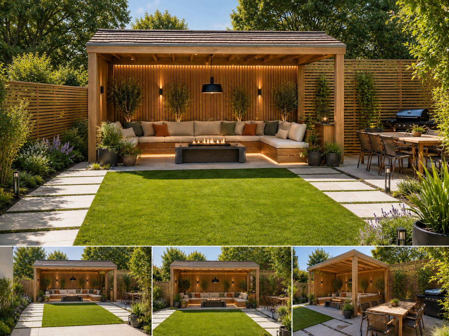
The first answer was annoyingly seductive. It gave us a timber pavilion glowing at night, an L-shaped sofa, a fire table, layers of warm light and planting around the edges. For the first time, that end of the garden looked like somewhere we would choose to spend an evening.
It also kept the gravel, water butt and arch.
The shortest design critique so far
My contribution to the next round may be the shortest design brief in landscaping history:
I hate stones.
That was the useful moment. AI had not failed because the image was ugly. It had failed because it had solved the wrong version of the garden.
We told it that the water butt and arch could go and asked to see the idea in daylight. The next concept replaced the sea of gravel with a simple green lawn, pale large-format paving and much more generous planting. The garage end started to feel connected to the rest of the garden rather than like a handsome shed sitting in a car park.
The public image on this page is a later privacy-safe interpretation of that daytime direction. We removed the recognisable side-access and neighbouring-property cues before publishing it.
What we kept—and what we binned
We kept the feeling:
- a warm timber room rather than a lightweight gazebo
- a big sociable sofa
- soft, layered lighting rather than one brutal floodlight
- planting wrapped around the room
- a simple lawn and pale paving giving the whole thing somewhere to breathe
We binned the idea that an existing feature deserved to stay merely because it happened to be in the photograph.
That sounds obvious now. It was not obvious when the first lovely image appeared on screen.
The reality check
None of these pictures preserved the garden accurately. The AI changed buildings, boundaries, planting, levels and proportions whenever it suited the composition. The timber frame, roof, fire, paving and lights were visual suggestions—not specifications.
What the image gave us was a direction we could react to. That was enough for this stage.
The next question was better: if we were sitting on that sofa, what would we actually be looking at?
Behind this outcome
Learn how to critique an AI garden image
Planned for the Space: the prompt sequence, rejected versions and visual critique checklist we used to separate useful ideas from invented detail.